
Venture is an quarterly issued Editorial Publication that focuses on Ecotourism & Sustainable Travel. The goal of this design is to bridge the gap between editorial design and traditional educational journals in order to amplify and project the significant scientific findings, tips and information to a fresh audience. Venture aims to harness the power of effective, simple, aesthetically pleasing, user-friendly visual communication in order to showcase ecotourism.
VENTURE

TRAVEL MAGAZINE- EDITORIAL DESIGN
Creative Brief
Design an educational journal or magazine on the topic of your choice that appeals to your target demographic. The topic I selected was ecotourism, as I find a lot of inspiration from European destination photography. The gap in visual communication practices between editorial design focused publications and educational journals is stark, and in order to appeal to my target demographic, I wanted to bridge this gap. By creating an educational journal that utilizes unique typography, negative space, imagery emphasis, and layouts, I was able to achieve a more compelling visual experience that appeals to a younger, larger demographic.
Client
UC Berkeley Extension
Year
09/01/2021
Project
06
Course
Visual Design Principles & InDesign
06
2021

COVER SERIES DESIGN
Category:
Editorial Print Design- Ecotourism Magazine
Deliverable:
Front Cover, Back Cover & Spine - 3 Volumes
-
Individuals of any age who enjoy traveling, photography and elegant typography and who are also interested in ecotourism & sustainable travel.
-
Ecotourism is an educational magazine issued quarterly that addresses the importance of sustainability and environmental consciousness when traveling. This is essential as many beautiful travel destinations around the world are facing the threat of environmental damage. In order to preserve both the nature in these destinations and the ability of travelers to experience it first hand, ecotourism provides solutions and suggestions on how to travel responsibly and sustainably in order to conserve the natural beauty that draws tourists to these locations in the first place.
-
To design an educational journal/ magazine for adults 18-35 years of age that is visually intriguing. Use images, color, layout and typography to make it more compelling and appeal to an audience that may not typically read educational journals but is interested in both travel and sustainability. Provide useful, simple and easy ideas on how to engage in ecotourism through careful design consideration regarding emphasis, harmony, pattern and proportion.


INSIDE SPREAD DESIGN
Category:
Editorial Print Design- Ecotourism Magazine
Deliverable:
Inside Spread article design & mockup- 1 volume

-
After researching ecotourism, I realized that there are a ton of easy ways to reduce our impact on the environment when we travel (a big contributor to environmental pollution). Unfortunately, as someone who travels often and tries to be very environmentally conscious myself, I know first-hand that these types of travel options are not widely advertised compared to traditional travel. The main problem here is that unless you are seeking to engage in ecotourism and actively include it in your search, you probably won't readily find these options when searching for transportation, activities, restaurants, retail stores, and hotels. I created this magazine in order to bridge this gap and bring ecotourism to the forefront of the travel industry and inform those who are interested in both nature and travel about these options in order to ultimately help reduce environmental damage. In order to do this I wanted to make the magazine very visually appealing and stand out from other educational journals through my color pallet, focus on images, and layout. I used fairly traditional fonts in order to maintain the professional demeanor expected of an educational magazine.
-
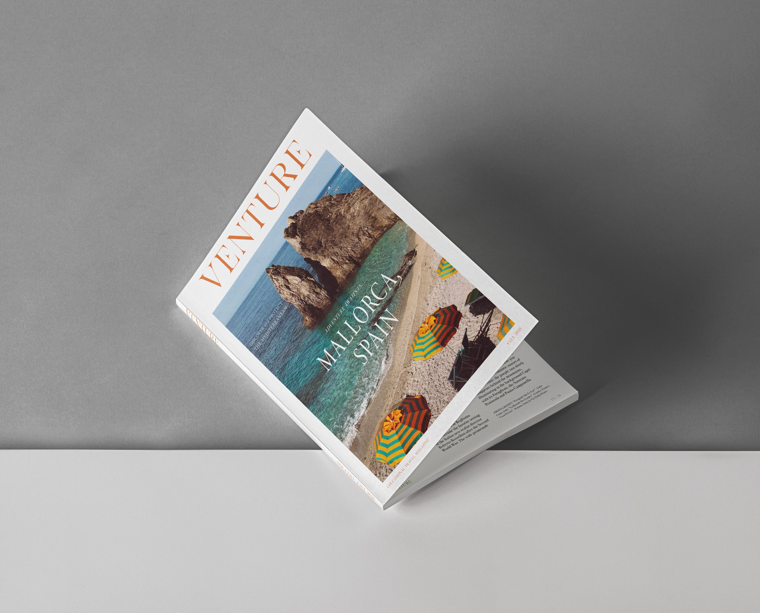
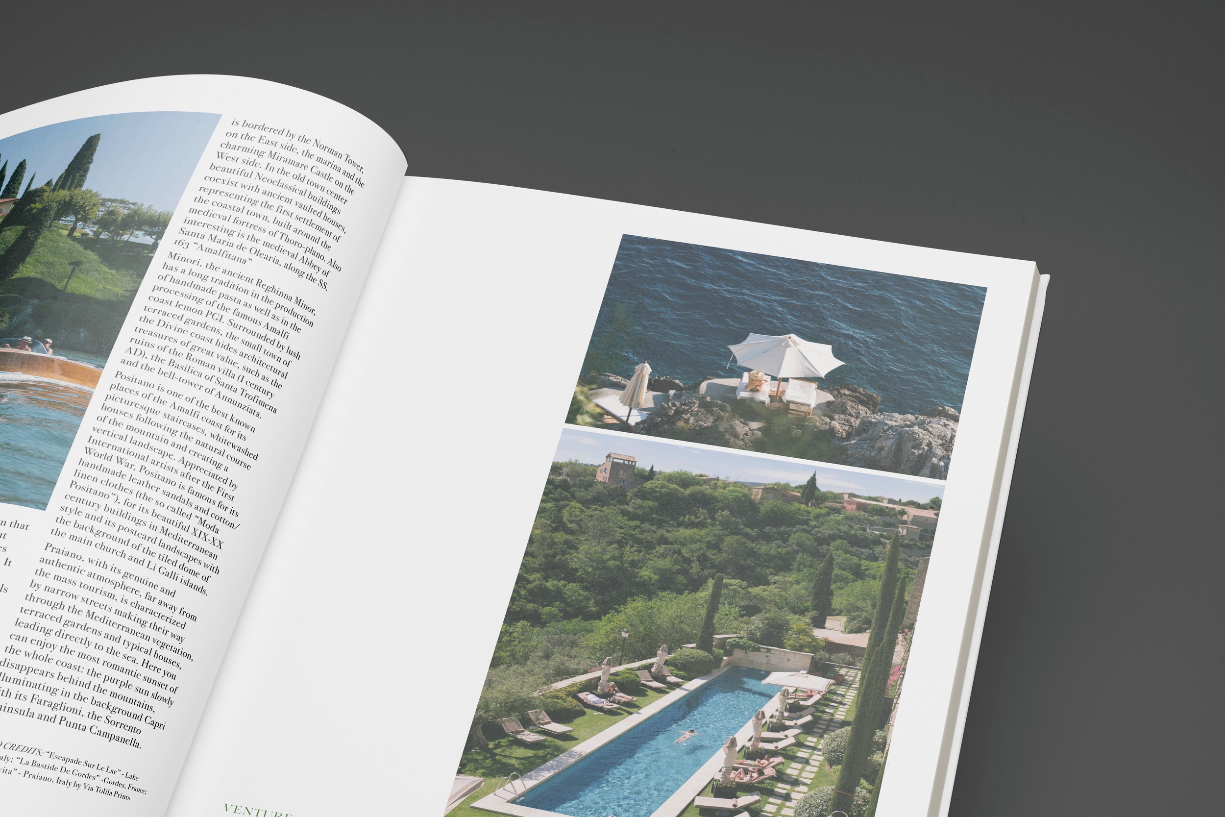
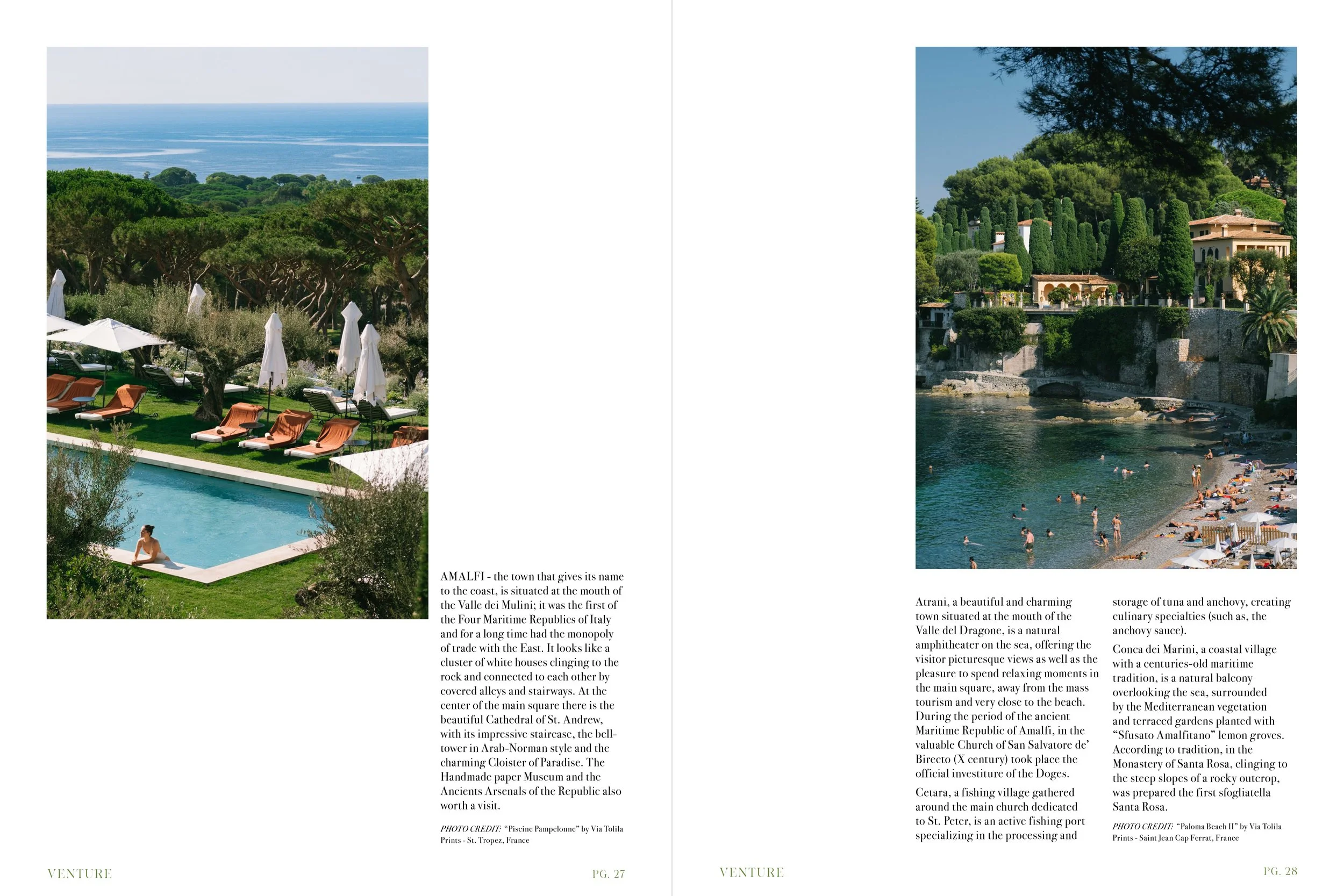
The magazine cover layouts are all focused on high quality, colorful images to draw the attention of the reader. The layouts are simple yet playful in order to standout from other educational journals, while still remaining simple, professional and informative. I created 3 edition covers for the quarterly magazine all of which place the central focus on a single vertical image, each showcasing a different beautiful travel destination and the environmentally sustainable tourism options that are available there. Each of these photos is accompanied by the custom mask-head that I created in illustrator by adjusting and distorting the typeface ‘brand’. The small arrow-like shape that serves as the bar of the letter ‘E’ was created by flipping the direction of the serif and detaching it from the stem of the letter. This design aspect also evokes a double meaning as it can be simultaneously perceived as a small airplane symbol. In addition to these 3 covers, I also included an inside spread with information about sustainable travel options in the Amalfi coast, Italy. I kept the inside spreads consistent with the covers by continuing the focus on imagery and elegant yet simple typography in order to be informative and aesthetically pleasing simultaneously.


COVER SERIES DESIGN
Category:
Editorial Print Design- Ecotourism Magazine
Deliverable:
Flat Files Front Cover design - 3 Volumes
-
Maskhead:
created with illustrator after expanding the typeface ‘brand’Cover header & subhead- Minion Variable Concept
Inside spread:
Bodoni 72 Old Style, Book & Italic -
Article: “Amalfi Coast” published via amalficoast.com- copyright Locali d’autore S.r.l.
All Photos: Via Tolila Prints
-
To design an educational journal/ magazine for adults 18-35 years of age that is visually intriguing. Use images, color, layout and typography to make it more compelling and appeal to an audience that may not typically read educational journals but is interested in both travel and sustainability. Provide useful, simple and easy ideas on how to engage in ecotourism through careful design consideration regarding emphasis, harmony, pattern and proportion.


< PREVIOUS