Clean Care is an innovative Online E-commerce brand that sells makeup, skincare, and shower products that are certified clean and tested by expert scientists. There is a large market segment of consumers who create Online communities in order to find clean products and share their personal experiences and knowledge despite the difficulty. I created Clean Care in order to make products that are natural and free of chemicals accessible and easy to purchase, while simultaneously educating our customers on the benefits of using clean products. Clean care is a chic, elegent, trendy, user-friendly solution to this problem of toxic beauty products.
CLEAN CARE
BRAND IDENTITY DESIGN
Creative Brief
To create a visual identity package that includes a logomark, logotype, multiple logo variations, color palette, typefaces & typography guide for a brand of your choice, either pre-existing or personally conceptualized. To expand upon this brand identity, design print and digital marketing materials, a corporate stationary package, website and app wireframe designs and packaging.
Project
01
Course
Visual Design Principles
Client
UC Berkeley Extension
Year
01/01/2022
01
2022

LOGO DESIGN
Category
Logo Creation & Development - Iconography & Typography
Deliverable:
Logomark & Logotype - Applied throughout the entirety of the brand identity / project


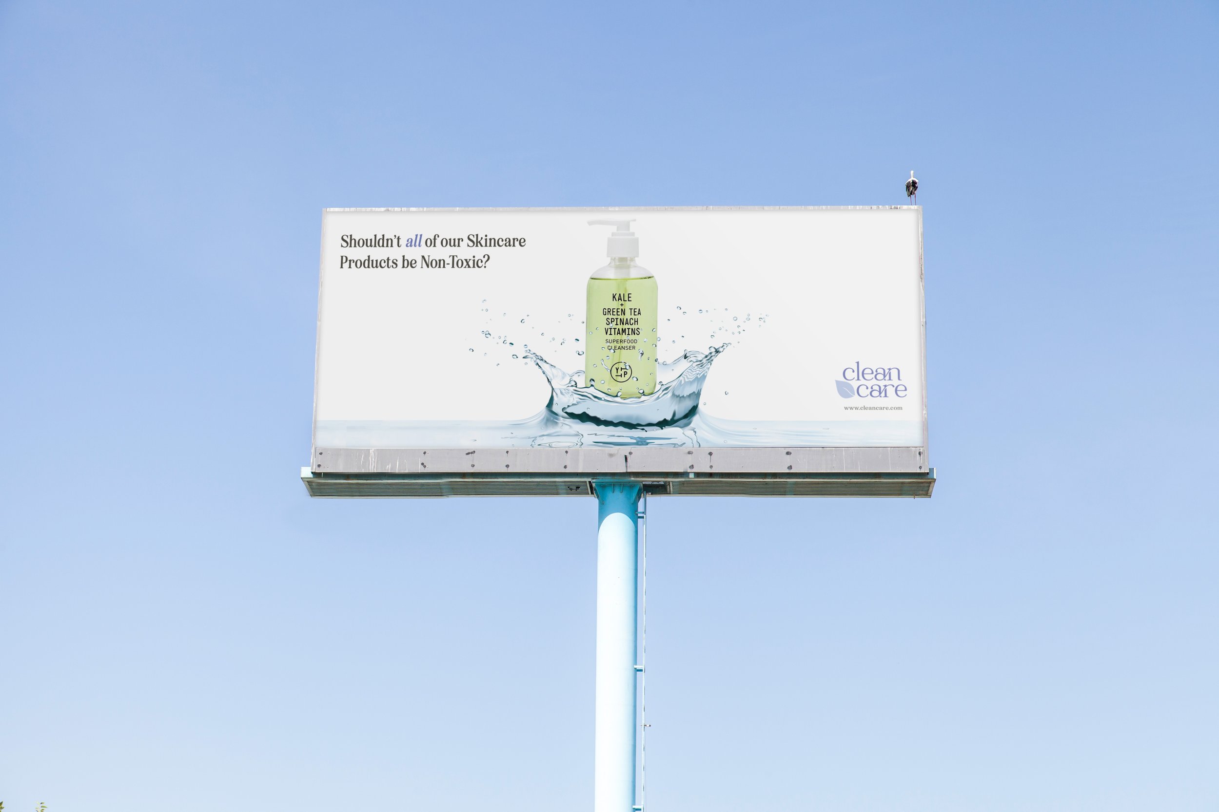
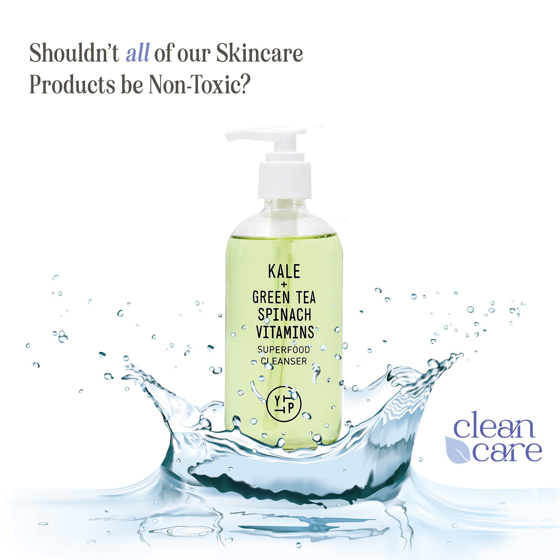
ADVERTISEMENTS
Category:
Print & Digital Advertisements
Deliverable:
Social Media (Instagram) & Billboard Ads
-
Young women ages 18-35 who are a part of the “non-tox” community and wish to use products that are free from harmful chemicals.
-
I began this project with a prior interest in clean beauty. After doing market research, I noticed an extreme gap between the innovative brand identities, marketing campaigns and website designs that are utilized by large beauty brands compared to that of smaller, natural beauty brands. The market is flooded with appealing, well designed products that contain harmful chemicals; simultaneously, there is major market demand for well-designed products that are non-toxic. In order to appeal to this determined, educated, skeptical community, the brand needed to evoke an innovative, fresh, reliable, and sustainable sentiment through user-friendly, educational, striking design.
-
To create an elegant, innovative, striking, reliable, sustainable, approachable brand identity for clean care that appeals to the target audience and fulfills a market need that is currently not being satisfied. In order to create a brand that is as equally impressive as the science behind these products, the focus is placed on consistent typography, cohesion, color, messaging and imagery. To appeal to the target demographic through user-friendly, informative, compelling design that is both accessible and educational.


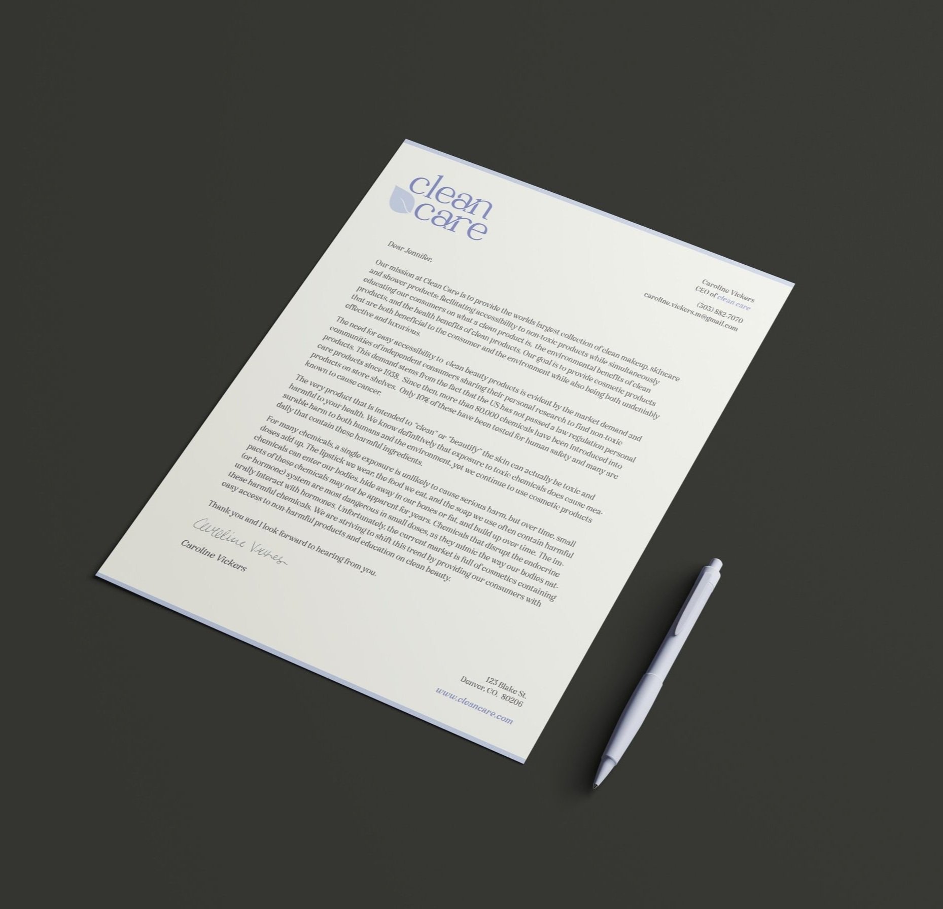
BRAND STATIONARY PACKAGE
Category:
Printed Full corporate Stationary Package
Deliverable:
Branded Letterhead, #10 Envelope & Business Card


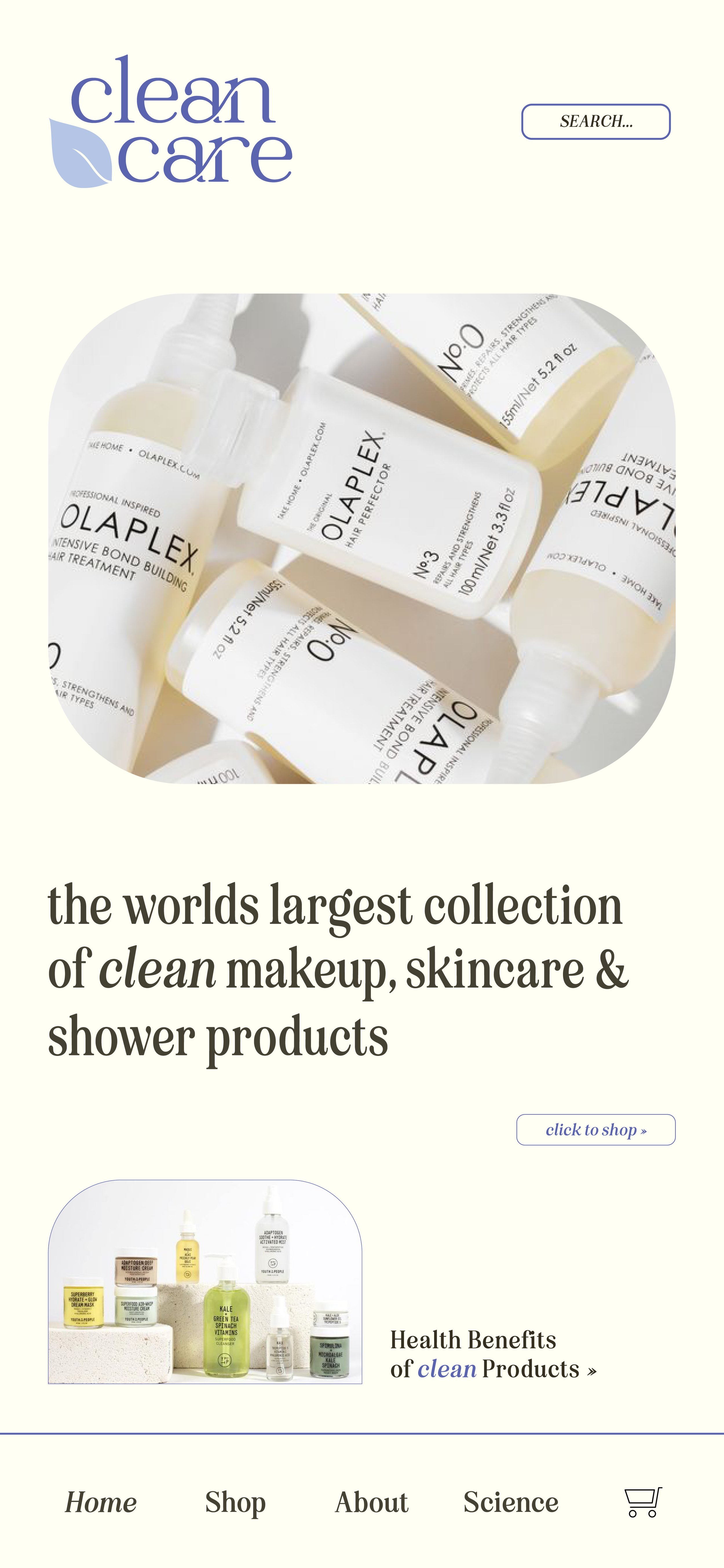
WEBSITE & APPLICATION
Category:
Website and App Digital Design
Deliverable:
Website & Mobile Application Wireframes
-
I researched a lot of clean skincare and beauty brands and realized that most of the brands that are organic, non-toxic, and clean were surprisingly hard to find despite the market demand. Even though there is a large community of people seeking these types of products, the most accessible and popular beauty product are full of harmful chemicals. I realized the need for an Online platform where customers can purchase clean products easily and efficiently, without having to do hours of personal research to ensure their safety. I then created defining attributes, traits, and a mood board for the brand and generated the brand identity around these central ideas in order to convey the companies values. I created a business model canvas in order to inform my designs by focusing on what this brand could potentially offer and to whom its prevalent consumer demographics would be. After designing the logo and selecting the color pallet and typefaces that I felt best represented the concept behind this brand, I continued my design process by developing the website and app wireframes for the online platform as this would be the primary mode of sales for the brand. The next step of my design process was the development of advertising materials (social media & billboard), primary packaging, and company stationary in order to fully build out the unique brand identity.
-
My design implements a simple color palette consisting of blues and cream in order to evoke a feeling of reliability, responsibility and soothing. I wanted the logo and website to appear professional and elegant while also being playful and empathetic in order to convey the values behind the brand. I kept my typeface usage consistent across all brand materials in order to create a cohesive, recognizable brand identity. After creating the logo and brand identity package, I created a corresponding website and app design with the goals of accessibility, simplicity and information delivery. In order to further expand on the identity of the brand, I created both digital and print advertising materials for clean care. The final step in my solution was to create company stationary and primary packaging for the shipping of the products in order to emphasize the reputability, professionalism and science oriented nature of the company.
-
Adobe Illustrator | Adobe Photoshop | Adobe InDesign


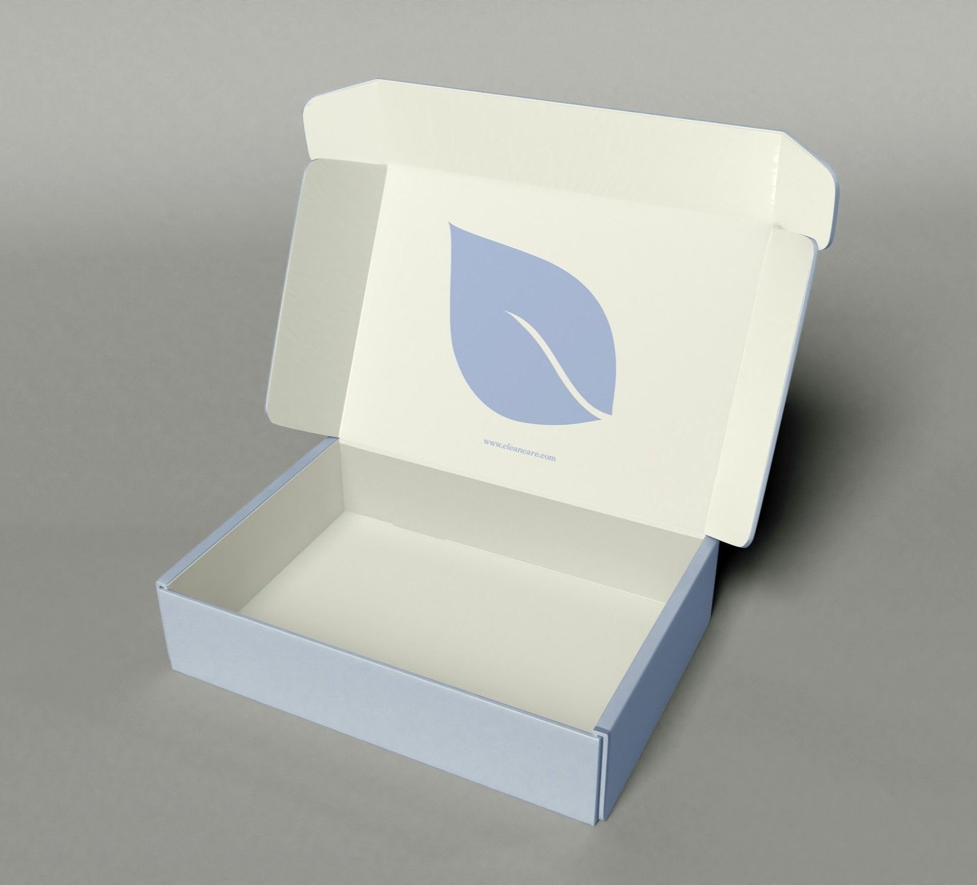
PACKAGING DESIGN
Category
Packaging Design & Realistic Mockup
Deliverable:
Custom Primary Shipping box used for all orders placed online
-
EightiesComback VAR - Semi Bold Semi Condesed & Medium
EightiesComback_It Var - Semi Bold Semi Condesed & Medium
-
Billboard, Social Media Advertisement and the Website Wireframes feature a product photo of the ‘Kale + Green Tea Spinach Vitamins Superfood cleanser’ by the brand Youth to the People.
The website wireframes also feature product photos of:
The “Kombucha + 11% AHA Exfoliation Power Toner” by Youth to the People, The “Super Amino Gel Cleanser” by Summer Fridays, The “Molecular Cosmetics Night Serum” By Dr. Barbara Sturm & The “Suade” collection by Byredo.
-
Light Blue - #B5C5E5
R= 181 G= 197 B= 230
C= 27.33 M= 16.44 Y=0 K=0Dark Blue - #5B65AE
R= 91 G= 100 B= 174
C= 72.82 M= 65.78 Y=0 K=0Cream - #FFFEF4
R= 255 G= 255 B= 243
C= 0 M= 0 Y=4 K=0Faded Black - #423F3C
R= 66 G= 63 B= 60
C= 64.82 M= 60.31 Y= 62.8 K= 48.80